


White Moonlight Icon Pack
4.626.00 Reviews
App Specs
- Version
- 6.9
- Updated On
- License
- $0.69
- Downloads
- 10,000+
- Developer
- PizzApp Design
- Categories
- Personalization
- Platform
- Android
Screenshots
 Analysis by AppCompare
White Moonlight Icon Pack is the kind of personalization app I would recommend to someone who wants a calmer Android homescreen without redesigning every part of the phone. I used it as a visual cleanup tool rather than as a complete launcher replacement, and that distinction matters: its value depends heavily on whether your launcher can apply icon packs properly and whether you enjoy a deliberately restrained look.
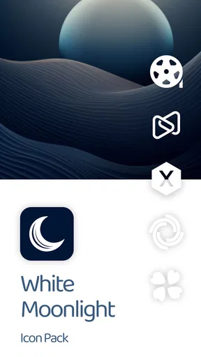
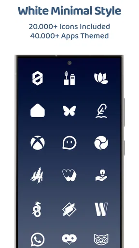
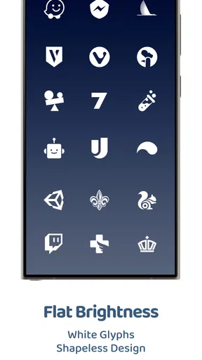
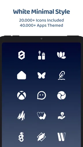
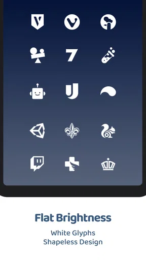
The concept is simple. The icons use a white, shapeless style that removes much of the visual noise created by bright app logos and mismatched icon shapes. On a dark wallpaper, the result can feel especially tidy. On a pale background, the same white treatment may lose contrast, so the final appearance depends as much on your wallpaper and launcher layout as on the pack itself.
Developed by PizzApp Design, this is a paid personalization app priced at $0.69, with optional in-app purchases ranging from $0.49 to $2.99 per item. It is rated for Everyone, and the current version is 6.9. The app supports Android 7.0 and later, which makes it accessible to people using older devices as well as newer phones.
Where the setup usually becomes confusing
I find the confusing point is usually the handoff between the icon pack and the launcher: installing the pack does not, by itself, tell every homescreen which artwork to use. In this section, I’ll focus on spotting that distinction early, so the next checks can be aimed at the right settings rather than at repeated installs.
The icon pack is not the same as a launcher
The first thing I would clarify to a new user is that an icon pack normally changes the artwork used for app shortcuts; it does not necessarily control the homescreen itself. If you expect White Moonlight Icon Pack to rearrange widgets, alter gestures, replace the app drawer, or change the lock screen, you may be disappointed. Those responsibilities usually belong to the launcher or the phone’s own interface.
This is also why two people can install the same pack and get different results. One launcher may offer a direct icon-pack selector, while another may require an appearance menu or a separate customization screen. Some manufacturer interfaces expose fewer options than popular third-party launchers. The pack can be installed correctly and still appear inactive simply because the launcher has not been told to use it.
In my experience, the most useful first check is to open the launcher’s settings and look for wording such as icons, theme, icon style, or icon pack. I would not start by repeatedly reinstalling the app. Reinstallation rarely solves a launcher-selection problem, and it can make it harder to tell which step actually fixed the issue.
Worth Reading Before You Choose

EA SPORTS FC Mobile 26 Is a Bigger Football Game, but It Takes Time
Flipboard Shows What News Apps Must Do Beyond the Feed

Switching to Android Auto Means Rethinking Your Driving Routine
Google Calendar Makes a Crowded Week Easier to Manage
Ludo King Makes the Most of the Minutes Between Plans

Baby Panda World Brings Quick Play to Modern Phones, but Its Game Library Feels Busy
Expect an overall style, not identical coverage everywhere
A white shapeless design works best when the applications you use most often are represented consistently. However, an icon pack may not visually replace every shortcut on every phone. System tools, manufacturer utilities, newly installed apps, private shortcuts, and unusual third-party applications can remain unchanged or appear different from the rest.
That mixed result is not automatically a defect. It is a normal trade-off with themed icons: the more varied your app collection, the more likely you are to see a combination of themed and original symbols. I found that the effect looked much more intentional after moving rarely used apps away from the first page and keeping the main screen limited to the shortcuts that received the cleanest treatment.
There is another subtle issue with the shapeless approach. Traditional circular or square icons create visual boundaries around each app. White Moonlight removes much of that boundary, so spacing becomes more important. If your launcher uses tight icon spacing, the white marks can look crowded. Increasing the distance between rows, reducing the number of columns, or choosing a darker wallpaper can make the same pack feel substantially more polished.
Why the preview can differ from the homescreen
Any preview inside an icon-pack app is only a guide. The launcher may scale icons differently, add its own background treatment, or place a badge over the artwork. Notification badges are particularly important because a colored number or dot can interrupt an otherwise monochrome layout. If the homescreen looks less minimal than the screenshots, check the launcher’s icon size, badge settings, and spacing before judging the artwork itself.
I also recommend checking a single homescreen page before applying the style across the entire device. This gives you a quick way to see whether the white icons remain readable with your chosen wallpaper and whether your launcher adds shadows or labels that compete with the design. It is a small test, but it avoids creating a large cleanup job when the visual balance is wrong.
Setup checks that save time
Before changing several visual settings, I’d confirm which launcher is active and whether it exposes an icon-pack selector. I also find it useful to test one page with a dark wallpaper first; that makes it easier to separate a selection problem from a contrast or spacing issue when you reach the setup checks that save time.
Start with the launcher, not the wallpaper
Before changing the background, confirm that the launcher actually supports third-party icon packs. If its customization area has no icon-pack option, White Moonlight may not be able to apply itself directly there. In that situation, switching to a launcher with icon-pack support is a more realistic solution than trying the same installation repeatedly.
Once support is confirmed, apply the pack from the launcher’s appearance settings if possible. Some launchers open the icon pack and let you press an apply button; others expect you to select the pack from their own settings. Both routes can be valid. The important point is to complete the selection inside the launcher that controls your current homescreen.
If you use more than one launcher, verify which one is currently active. Android devices can retain several launchers, and applying a theme while looking at a different homescreen can create the impression that nothing happened. I would check the default home app first, then return to the active launcher and repeat the selection there.
Use contrast as part of the installation
White Moonlight is not a neutral choice for every wallpaper. A charcoal, deep blue, or textured dark background usually gives the white artwork enough separation to remain legible. A bright photograph, light gradient, or white background can make icons fade into the page. This is not a reason to reject the pack, but it does mean that the wallpaper should be chosen as part of the theme rather than as an afterthought.
For a practical test, place your most-used shortcuts on the first page and inspect them in both bright and dim room lighting. A design that looks crisp at night may be harder to read beside a sunny window. If labels are enabled, they can preserve usability, although they also make the homescreen less visually spare. I prefer short labels or no labels only when I already recognize the icon shapes quickly.
Keep the first application simple
When setting up a new icon style, I would avoid changing the launcher grid, widgets, wallpaper, gestures, and notification settings all at once. Make the icon pack the only change, test it, and then adjust the surrounding elements. This makes troubleshooting much easier because you know which change affected the result.
A useful sequence is to apply the pack, return to the homescreen, open several themed shortcuts, and then check the app drawer. If the icons appear in one place but not another, the difference may come from launcher-specific display options rather than from the pack. If they do not appear anywhere, return to the launcher’s icon settings and confirm the selected pack again.
What the age and Android requirements mean in practice
The Everyone content rating makes the app suitable for a broad audience, including people who simply want to adjust the appearance of a family member’s phone. Its Android 7.0 minimum also means that older devices may be eligible to run it. Eligibility, however, is not the same as identical behavior: an older phone may use a manufacturer launcher with fewer theme controls than a newer device.
That is why I would treat the Android requirement as a compatibility starting point, not a promise that every launcher will offer the same setup. If you are helping someone remotely, ask which launcher is active and whether its settings include icon-pack support before assuming the app itself is malfunctioning.
Recovering the workflow when icons do not apply
When icons fail to appear, I prefer to narrow the problem down rather than reset the whole homescreen. The key clue is whether none of the shortcuts changed or only a few did, since those point to different causes; the following section walks through a cautious recovery path that preserves the rest of your layout.
Refresh the launcher in a controlled way
If the pack appears selected but the homescreen still shows the old icons, I would first leave the launcher settings and return to the homescreen. Open the app drawer, move to another page, and come back. Some interfaces refresh their icon cache only after navigating away from the customization screen. A restart of the phone can also be a reasonable general step if the launcher continues displaying stale artwork.
Another safe recovery method is to switch temporarily to a different icon style inside the launcher and then select White Moonlight again. This forces the launcher to process a new selection rather than assuming that the current setting is unchanged. I would make this change only through the launcher’s normal appearance controls, not by deleting folders or resetting the entire homescreen.
Handle individual icons separately
If most icons change but a few do not, do not reset everything immediately. Check whether the unchanged shortcut is a web shortcut, a manufacturer tool, a duplicated app, or a shortcut created by a widget. These items may not behave like ordinary installed applications. Removing and recreating a shortcut can sometimes help, but I would first confirm that the shortcut itself is the unusual element.
For a mixed homescreen, I find it more practical to group less-compatible apps in a secondary folder than to abandon the whole visual style. You can keep the first page focused on frequently used apps that match well, while leaving specialist tools in the app drawer. This approach turns incomplete coverage into a design choice and keeps the main screen from looking accidental.
Do not confuse a missing icon with a missing application
Changing an icon pack should not be treated as an app-management operation. If a shortcut disappears, search for the application in the app drawer or device search before making further theme changes. The launcher may have moved the shortcut, hidden it, or replaced a manually placed shortcut during a layout adjustment. The safest workflow is to confirm the application still exists, then recreate its shortcut if necessary.
I also recommend taking a quick mental note of your original homescreen arrangement before experimenting. You do not need a complicated backup routine for a small visual change, but knowing which folders and widgets were present makes recovery less frustrating. The goal is to repair one visual setting, not to rebuild the phone from memory.
When optional purchases enter the picture
The app costs $0.69, while optional items are listed between $0.49 and $2.99 each. I would decide before setup whether the basic white style already meets your needs. If it does, there is no reason to purchase extras simply because the first application feels incomplete. A launcher compatibility issue will not normally be solved by buying an additional item.
For users who do choose an optional purchase, keep the troubleshooting steps separate from the purchase decision. First establish that the launcher can apply the main pack. Then evaluate whether the additional content improves the particular homescreen you are building. This avoids spending money while the real problem is still an unsupported launcher or poor wallpaper contrast.
When the app is not the cause
A stubborn icon is not always evidence that the pack has failed: the launcher, shortcut type, wallpaper, or display settings can all affect what you see. I’ll use this last section to help distinguish those cases, so you can decide whether a small adjustment will help or whether your launcher simply offers a better route.
Launcher limitations are the most common explanation
If the pack installs normally but there is no way to select it, the launcher is the first place I would investigate. Some default interfaces intentionally limit customization, and a phone update can also move or simplify appearance controls. In that case, the practical options are to use the launcher’s available settings, choose a compatible launcher, or accept that the device does not expose this kind of theming.
This is especially relevant for people buying a personalization app for a work phone or a family member’s device. Before paying, check whether the current launcher supports icon packs. The low purchase price makes experimentation relatively easy, but compatibility remains more important than cost.
Wallpaper and display settings can change the impression
White icons may look gray, faint, or uneven when the phone applies a dimming mode, a display filter, or a bright background. The pack itself may be working exactly as intended while the screen settings reduce contrast. Compare the homescreen with a plain dark wallpaper and normal display brightness before drawing a conclusion.
Accessibility settings can also affect how the interface feels, particularly if text size, magnification, or contrast adjustments are enabled. These settings are valuable and should not be disabled just to preserve a theme. Instead, treat readability as the priority. A minimalist homescreen is successful only if you can identify and open your apps comfortably.
Updates and caches can create temporary visual mismatches
After a launcher update or an operating-system update, icons may briefly appear inconsistent while the interface rebuilds its visual cache. The sensible response is to reopen the launcher, check the selected pack, and restart the device if needed. I would avoid clearing broad device storage or resetting the launcher unless you understand exactly what will be removed, because those actions can affect folders, widgets, and layout choices.
If only one application remains unchanged after the rest of the homescreen updates, that points more toward coverage or shortcut behavior than a total failure. If every icon remains unchanged, the launcher selection is the stronger suspect. Separating those two cases prevents unnecessary troubleshooting and helps you choose the right next step.
Who should choose something else
I would skip White Moonlight Icon Pack if you want colorful, highly detailed artwork or if you expect a complete phone makeover from one installation. The white shapeless treatment is intentionally restrained, so people who rely on strong color cues to identify apps may find it less immediate than the original icons.
I would also look elsewhere if your main goal is advanced launcher control, animated effects, custom widgets, or a large set of layout tools. An icon pack can complement those features, but it does not replace them. In that situation, a more comprehensive launcher or a theme system designed for your specific phone may be the better investment.
My practical verdict after using the pack
White Moonlight Icon Pack succeeds when you approach it as a focused visual layer. Its white, shapeless artwork can make a busy Android homescreen feel quieter, especially when paired with a dark background, generous spacing, and a carefully chosen group of primary shortcuts. I like that it does not demand a complicated redesign to make a noticeable difference.
The main friction is not the idea of the pack but the path between installation and application. Launcher support, icon coverage, shortcut types, contrast, and refresh behavior all affect the result. That means the app is easiest to recommend to someone who already knows how to open launcher settings and is comfortable making small layout adjustments.
Its 4.6 average from around 339 ratings and more than 10K installs suggest that it has found an audience, while the 26 written reviews offer additional user feedback to consider before downloading. I would read those comments with your own device in mind, because launcher compatibility can matter more than the overall rating for a personalization tool.
For an everyday scenario, imagine checking your phone repeatedly during a busy morning. A dark wallpaper, a small first-page layout, and these white icons can reduce the visual clutter between messages, maps, calendar tools, and music. The benefit is not that the phone becomes faster; it is that the screen feels more deliberate and less like a collection of unrelated brand marks.
My recommendation is straightforward: choose it if you want a low-cost, monochrome homescreen accent and your launcher supports icon packs. Apply it gradually, test contrast before rearranging everything, and keep unmatched shortcuts out of the main visual focus. The best result comes from treating the icon pack, launcher, wallpaper, and spacing as one small design system. If you want deep customization or instant consistency across every shortcut, a broader launcher-based solution will probably suit you better.
Pros
- Elegant white moonlight theme gives icons a clean
- premium look.
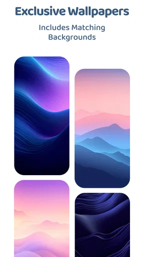
- Includes matching wallpapers for a more consistent home-screen style.
- Works with many popular third-party Android launchers.
- Frequent icon updates can expand coverage for newer apps.
- Simple design blends well with light
- dark
- and minimalist setups.
Cons
- Requires a compatible launcher; it may not work with the default launcher.
- Some less popular apps may remain without custom icons.
- The bright palette can reduce contrast on very light wallpapers.
- Icon requests and updates may depend on the developer’s support schedule.
- Customization options are limited if you prefer colorful or detailed icons.
FAQs for White Moonlight Icon Pack
What is White Moonlight Icon Pack?
White Moonlight Icon Pack is a custom icon theme designed to give compatible Android devices a clean, bright, and elegant appearance. It generally replaces standard app icons with carefully styled white icons, often paired with soft shapes or subtle details. The pack is intended for users who want a more consistent home-screen design than the default icons provided by their phone.
Which devices and launchers are compatible with White Moonlight Icon Pack?
Compatibility depends mainly on the Android launcher installed on your device. White Moonlight Icon Pack is typically used with popular third-party launchers that support icon packs, such as Nova Launcher, Lawnchair, Microsoft Launcher, Smart Launcher, and similar options. Some phone manufacturers may require a compatible launcher or manual application, so checking the pack’s supported-launcher list before downloading is recommended.
How do I apply White Moonlight Icon Pack to my home screen?
After installing the icon pack, open it and look for an Apply, Set, or similar option. Select your preferred compatible launcher from the available list, then confirm the change. You can also usually apply it through the launcher’s customization settings by opening the icon or theme section. If some icons remain unchanged, the launcher may not support them automatically, and manual icon selection may be necessary.
Does White Moonlight Icon Pack include icons for every application?
No icon pack can guarantee coverage for every application, especially newly released or less popular apps. White Moonlight Icon Pack may include a broad collection of themed icons, but unsupported apps can retain their original appearance. Depending on the launcher and the pack’s features, you may be able to request missing icons, use automatically generated alternatives, or assign a custom icon manually.
Is White Moonlight Icon Pack free, and does it affect phone performance?
The price and included features can vary depending on the version and store listing, so users should confirm the current details before downloading. An icon pack normally has very little effect on performance because it mainly changes visual assets rather than running continuously as a demanding application. However, launchers, animated wallpapers, or additional customization tools used alongside it may consume more battery or memory.


